[16] Flexbox (flex-direction, flex-wrap, flex-flow, justify-content, align-items, align-content, align-self, flex item order, flex-grow, flex-shrink, flex-basis, flex)
반응형 웹사이트를 디자인할 때 요소가 웹사이트를 사용하는 장치 유형에 따라 너비, 높이, 해상도, 방향 등과 같은 동작을 변경하기를 원할 것이다.
이번에는 flexbox 레이아웃을 사용하여 요소를 반응형으로 만드는 방법에 대해 설명하겠다.
flexbox란?
CSS Flextbox는 요소를 효율적이고 동적으로 배열할 수 있는 레이아웃 모델이다.
이 레이아웃은 1차원이며 공간이 균등하게 분산된 컨테이너 내부에 요소를 배치할 수 있다.
또한, 요소를 반응형으로 만든다.
즉, 요소를 표시하는 장치의 종류에 따라 요소의 동작이 변경된다.
요소를 유연하게 만들고 적절한 위치와 대칭을 제공한다.
Flexbox는 컨테이너의 항목을 보다 효율적이고 동적으로 정렬하기 위해 CSS 버전 3에 도입되었다.
Flexbox 이전에는 처음에 아래에 나열된 네 가지 레이아웃 방법이 있었다.
1. Block
웹 페이지에서 섹션을 생성하기 위해 블록 레이아웃이 사용된다.
2. Inline
텍스트에서 사용되는 레이아웃 방법이다.
3. Table
2차원 데이터가 있는 테이블에 사용된다.
4. Positioned
이것은 요소의 특정 위치에 사용된다.
flexbox 뿐만 아니라, 나중에 배울 grid css도 같이 레이아웃을 잡기 위해 반응형으로 많이 사용함.


flexbox는 자주 쓰이고 중요하다.

Flex 속성들
1. Flex container 속성들
- flex-direction
- flex-wrap
- flex-flow
- justify-content
- align-items
- align-content
2. Flex items 속성들
- order
- flex-grow
- flex-shrink
- flex-basis
- align-self
우선 flex container 속성들 중 flex-direction 부터 알아보겠다.

flex-wrap
flex의 디폴트 특징대로라면 아이템 개수가 늘어나면 아이템의 크기가 줄어들며 어떻게든 단일한 줄에 포함시킬 것이다.
하지만 flex-wrap 설정을 해주면 줄 바꿈이 일어난다.

실습
<!doctype html>
<html lang="en">
<head>
    <meta charset="UTF-8">
    <meta name="viewport" content="width=device-width, initial-scale=1">
    <title>Document</title>
    <link rel="stylesheet" href="style.css">
</head>
<body>
    <div class="container">
        <div class="flex-item item-1">item 1</div>
        <div class="flex-item item-2">item 2</div>
        <div class="flex-item item-3">item 3</div>
        <div class="flex-item item-4">item 4</div>
        <div class="flex-item item-5">item 5</div>
        <div class="flex-item item-6">item 6</div>
        <div class="flex-item item-5">item 5</div>
    </div>
</body>
</html>

.container {
    border: 6px solid lightgray;
    display: flex;
    flex-direction: row;
    flex-wrap: wrap-reverse;
    /*flex-wrap: 기본값 nowrap */
}

.flex-item {
    color: black;
    font-size: 2rem;
    padding: 1rem;
    text-align: center;
}

.item-1 {
    background-color: lightblue;
}

.item-2{
    background-color: lightyellow;
}

.item-3 {
    background-color: lightpink;
}

.item-4 {
    background-color: lightgreen;
}

.item-5 {
    background-color: lightsalmon;
}

.item-6 {
    background-color: lightskyblue;
}
flex-flow

flex-flowsms flew-direction과 flex-wrap을 한꺼번에 사용함
실습
나머지는 동일

.container {
    border: 6px solid lightgray;
    display: flex;
    flex-flow: row-reverse wrap;
}
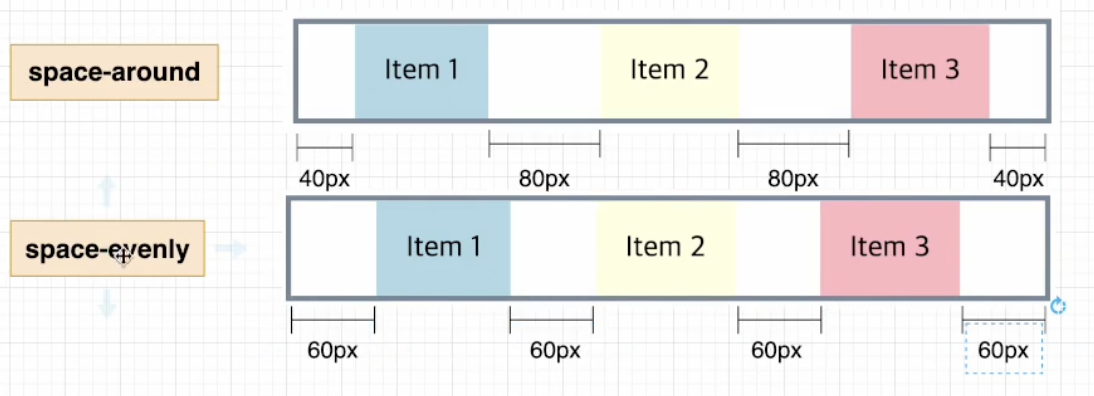
justify-content


굉장히 많이 사용함
space-around와 space-evenly 차이 알아두기.
align-items

baseline은 line에 텍스트들이 맞춰져있다.
align-content


align-self


Flex 속성들
1. Flex container 속성들
- flex-direction
- flex-wrap
- flex-flow
- justify-content
- align-items
- align-content
2. Flex items 속성들
- order
- flex-grow
- flex-shrink
- flex-basis
- align-self
이제 Flex items 속성들 중 order를 알아보겠다.
order은 기본적으로 플렉스 items는 소스 코드에 나열된 순서대로 배치된다.
그러나 order 속성은 플렉스 컨테이너에 나타나는 순서를 제어한다.
order 속성의 기본값은 0이다.


기본적으로 order값이 0이므로 item5가 item6 뒤로 감
flex-grow


아이템들이 100px로 되어있다. 지금 공간이 180px이 남아있는데, 이 180px를 나눠줘야함.
현재 flex-grow 1 1 0 2 로 4이다. 그래서 180px/4 = 45px를 주면된다.
flex-shrink


flex-basis

flex

flex 예시

